Thursday 28 February 2008

Experimental Layouts


This Book is very helpful through the 100 book research I find very inspirtaional pieces within the book and find new interesting designers amongst the book that inspire me with my ideas. I have put these artists onto my blog.

Printing Elective work


I am creating work and experimenting with printing processes at the moment in my printing elective and am creating some realy intresting marks such as this piece of cloth a simple to strong outcome with the sharp contrast between black and white onto different background adding and subtracting areas.

Tuesday 26 February 2008

Favorite books for contemporary research


The Picture Book Contemporary Illustration by Angus Hyland
Maximalism by Charlotte Rivers
These are two very influencial books that have inspired me within my past creative experiences.

Sebjarnot


As a refection on my Visual lines investigation simple lines & tests with inks is an area that I am testing in my Visual language studies at the moment. The subtle and harsh lines mix to leave an interesting effect. Sebjarnots work has a handmade feel to his style of work with an illustrative aspect. I find this style intreguing however I am developing on my mimimal designs in contrast with my strong intrest within maxamilism designs that i find usually cover the meaning of the message been communicated.

100 reserach


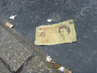
As a test for my outcome of research over reading week I decided to test peoples reactions and so I photocopied a £10 note and stuck it to the floor in different areas to test how many people woud walk past without knowing a £10 note was on the floor. I then video the outcomes and was shocked to see that in York for example 69 people walked past without noticing that it was there! I then made a £100 note even though it dose't actually exist to test the reactions again and I found the same again people were oblivious and were literally walking over the note.

Monday 25 February 2008

Projekttriangle


This idea of two tongues reminded me of germs how germs are spread something to test


I have developed a keen intrest in helvetica and find the typographic elements of the font work well in my informative packaging pieces that I have used recently such as my thiefs maps products. The type is very popular and a ledigble type used in a variety of designs.

Dads Diary

Leeds cameras everywhere psd project

Sunday 24 February 2008

Jo Ratcliffe Jocandraw.com


The advertising campaigne for criminal mind on living tv visually communicates to the audience criminal minds with the brain patterns created in a way that emphasises crime with the use of guns and violence in a monotone scheme. Taking into consideration all aspects of what is been communicated.

Thursday 21 February 2008

Skeleton Key Segamister


Segamister thought of all the ballon structured figures such as sausages fart cushions & blowfish and simply stuck holes through them. The idea is simple and get the point across in a creative and clever manner but without over complecating things. This is an area i need to take into consideration as I feel that in areas of my own work I tend to over crowd and Complicate areas making It difficult for my target audience to understand.

Anni Kuan Sagmeister


These raw images for a brochure fit with the context of the subject. The innovative front cover portrays clothing and fashion based around the idea of materials. The use of different materials within the brochure is something that I will take into consideration within the development and experimentation of the brief. The Visual communication of the mysterious bland colours intrigues the reader to explore into the images of the brochure.

Monday 18 February 2008

Richard Talbothttp://www.richardtalbot.org/

I use drawing as a way of thinking, and a way of bringing together apparently disparate ideas and images. Through drawing I can start with a gut feeling, a vague thought, a hunch or an idle observation and can distil and combine these into something concrete.

Drawing has become the major part of my studio practice, but I think of myself as a sculptor. Within the drawings, I develop forms associated with architecture, maps, landscape, water, vessels and containers, using a process (geometric linear perspective) that involves producing a complex and almost transparent matrix. This web of lines acts as scaffolding in which the images are created and then held. Importantly, and possibly paradoxically, a strict geometric drawing system such as perspective allows me to have an almost purely intuitive response to ideas and images.

My approach to making a drawing is comparable to that of the building a medieval/gothic cathedral, where a relatively rigid two-dimensional ground-plan was put in place, and the ensuing structure then developed organically, its form being the result of varying amounts of intention, pragmatism, accident and ambition.
The purpose of the paper is to demonstrate an approach and method for constructing perspectival space that may account for many of the distinguishing spatial and compositional features of key Renaissance paintings. The aim of the paper is also to show that this approach would not necessarily require, as a prerequisite, any understanding of the geometric basis and definitions of linear perspective as established by Alberti. In particular, the paper discusses paintings in which the spatial/geometric structure has often defied conventional reconstruction when the strict logic of linear perspective is applied. It specifically examines the spatial construction of four very different paintings in order to explain how the geometry and methods involved may shed light on Brunelleschi's architecture, as well as on some of the questions and issues surrounding the history, origins and nature of linear perspective.

Stereohype designers


This design by stereohype created again something that enabled you to look deeper into the artwork and to form an idea and understanding of what the artist was trying to state by the amount of people. I developed the idea to understand how much people carry with them whilst traveling it was an intresting aspect to study as people dont realise how much we carry around with us. I created my own of this idea within Leeds which worked well within my research and testing as I could identify catogries of people and what they tend to carry within an area.

Paula Amaral


I went to the exhibition in Sheffield and found the exhibited work realy relevant to the timeline project that I was creating. This work by Paula Amaral I found realy intresting. The large scale helped make the design work as a map exaggerating the unnessercery folding to achieve the result of looking for somewhere. The map was actually of a living room and everything was mapped onto the map in a mathmatical and technical format which enables you to work out the pieces in order for you to understand the theory. This inspired me within my work and helped me generate an intresting and inventive final outcome that worked in relation to context and format within the brief.

Cecilia Carlstedt


I have developed a keen intrest with the control and use of a graphite and subtle colours to generate a powerful technical drawing within my developental research of my graphic design studies. I was engaged by the use of careful peronal attention to detail within the drawing and the use of white space I feel is what makes this artwork stand out. I tend to overcowd my drawings and therefore they become to complecated and so this is where feel this drawing will benifit me in my developing contextual research.

Friday 8 February 2008